Monday, October 29, 2012
Shadow Play
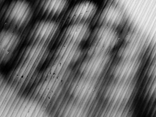
This picture is texture surface. In lightroom I increased the blacks, and increased the exposure.
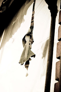
This picture is silhouette. In lightroom I cropped the picture and increased the blacks.
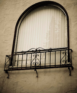
This picture is a pattern on an object. In lightroom I again increased the blacks and the exposure.
Friday, October 19, 2012
Wednesday, October 10, 2012
color grid

I think the green makes the subject look flat and doesnt make it pop. The blue makes the box have depth and shows the grid. The pink is almost the same color so it blends too much. The dark blue also makes the image stand out. The purple makes the image stand out as well and really compliments the subject. The yellow, to me, makes the image look boring and the tones of the color are the same so the yellow doesn't do anything for the subject.
Monday, October 8, 2012
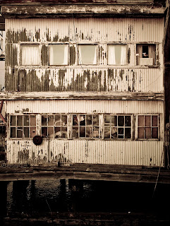
Top Old Houses
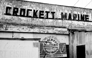
I went to Crockett to take these pictures. The first two I was walking around the streets looking at the houses. The last two I took by the Nantucket. For editing I used lightroom. I played with the presets until I got on that helped keep the picture looking old but interesting. I played with the brightness also.


Wednesday, October 3, 2012
Subscribe to:
Comments (Atom)
