Monday, December 10, 2012
Studio Shoot. OHH yeah.
This is my friend Natalie. For all the pictures she looked pretty red and was dark. In lightroom, I made it brighter and darkened the blacks to create the shadow. For some of the pictures I cropped them to get rid of extra space that may be distracting.
Wednesday, December 5, 2012
Tuesday, November 6, 2012
Four Shadow Pictures
This Picture was projecting a shadow onto an object (or person in my case). In lightroom I made it black and white and then played with the blacks and exposure .
This picture I tried to have the shadow of the toy g through the bubbles of the bubble wrap , but it didnt work all that well. In lightroom I just made it black and white and increased the blacks
Friday, November 2, 2012
Monday, October 29, 2012
Shadow Play
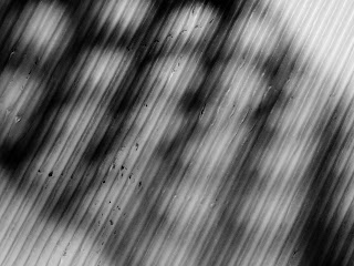
This picture is texture surface. In lightroom I increased the blacks, and increased the exposure.
This picture is silhouette. In lightroom I cropped the picture and increased the blacks.
This picture is a pattern on an object. In lightroom I again increased the blacks and the exposure.
Friday, October 19, 2012
Wednesday, October 10, 2012
color grid

I think the green makes the subject look flat and doesnt make it pop. The blue makes the box have depth and shows the grid. The pink is almost the same color so it blends too much. The dark blue also makes the image stand out. The purple makes the image stand out as well and really compliments the subject. The yellow, to me, makes the image look boring and the tones of the color are the same so the yellow doesn't do anything for the subject.
Monday, October 8, 2012
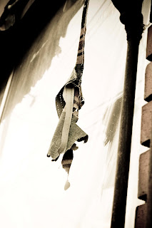
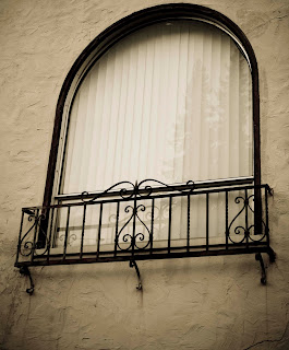
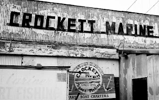
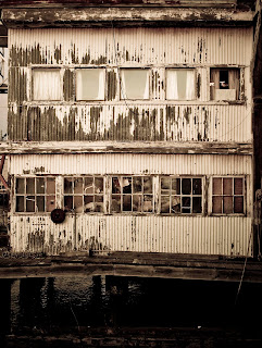
Top Old Houses
I went to Crockett to take these pictures. The first two I was walking around the streets looking at the houses. The last two I took by the Nantucket. For editing I used lightroom. I played with the presets until I got on that helped keep the picture looking old but interesting. I played with the brightness also.


Wednesday, October 3, 2012
Friday, September 28, 2012
Wednesday, September 5, 2012
Wednesday, May 30, 2012
Wednesday, May 16, 2012
Wednesday, May 2, 2012
Wednesday, April 18, 2012
Friday, March 30, 2012
juxtaposition.
this is juxtaposition because it shows a little foot with a bigger foot. in editing i went for a calm look and just brightened it up a bit.
this is because it is like a little piece of pretty in front of the ugliness. in editing i darkened the blacks and adjusted the exposure.
this is because it shows fire and ice, complete opposites being near eachother. in editing i completely darkend the blacks.
and finally this is because its a smaller hand reaching up toward a big hand. in editing i just adjusted the exposure.
Wednesday, March 14, 2012
Friday, February 24, 2012
Defining Light
This picture is chiaroscuro because there is shadows and the light has different tones throughout the photo. There is also a pattern in the shadow. I edited this picture by making the bridge and the sky more bright and brought out the green on the stairs.
This picture is specular because how the sun is coming in at the side and almost creating a spotlight on the ground, lighting up that whole section. The sun light is coming in a particular direction that is precise. I edited this picture by adding more contrast to make the sides more dark so the middle of the picture would be the lightest.
This photo is radiance because there is rays of light coming in from the window. The light from the window gives the effect of joy and comfort also. To edit the photo I made the contrast go up so the room is darker to show exactly the right direction of light from the window.
This last photo is illumination because it is filled with light and makes a glowing effect. The sun is highlighting the wall and creating a pattern from the shadow of the rail. It is filled with sunlight. I only brought out the clarity in this photo when I edited it and turned the contrast up a smudge.
Friday, February 17, 2012
Subscribe to:
Comments (Atom)


.jpg)



-2.jpg)
.jpg)


